Vencru — Product Redesign
Redesigning a SaaS platform to simplify financial workflows, improve onboarding, and reduce churn for small business owners.
PROJECT DETAILS
Role
Lead Product Designer
Team
2 Designers, 1 PM, 3 Backend Engineers, 2 Frontend Engineers, Founder
Company
Vencru
Scope
End-to-End Product Redesign
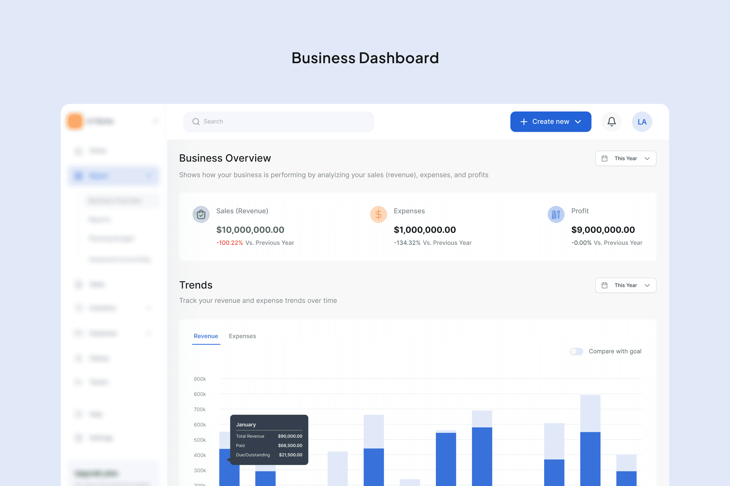
Old Business Dashboard vs. New Business Dashboard
Result 6 Months
After Launch
35%
Increase in onboarding completion
15%
Reduction in churn
Activation
More users completed onboarding and created their first invoice
Drop-offs
Simplified onboarding flow
Overview
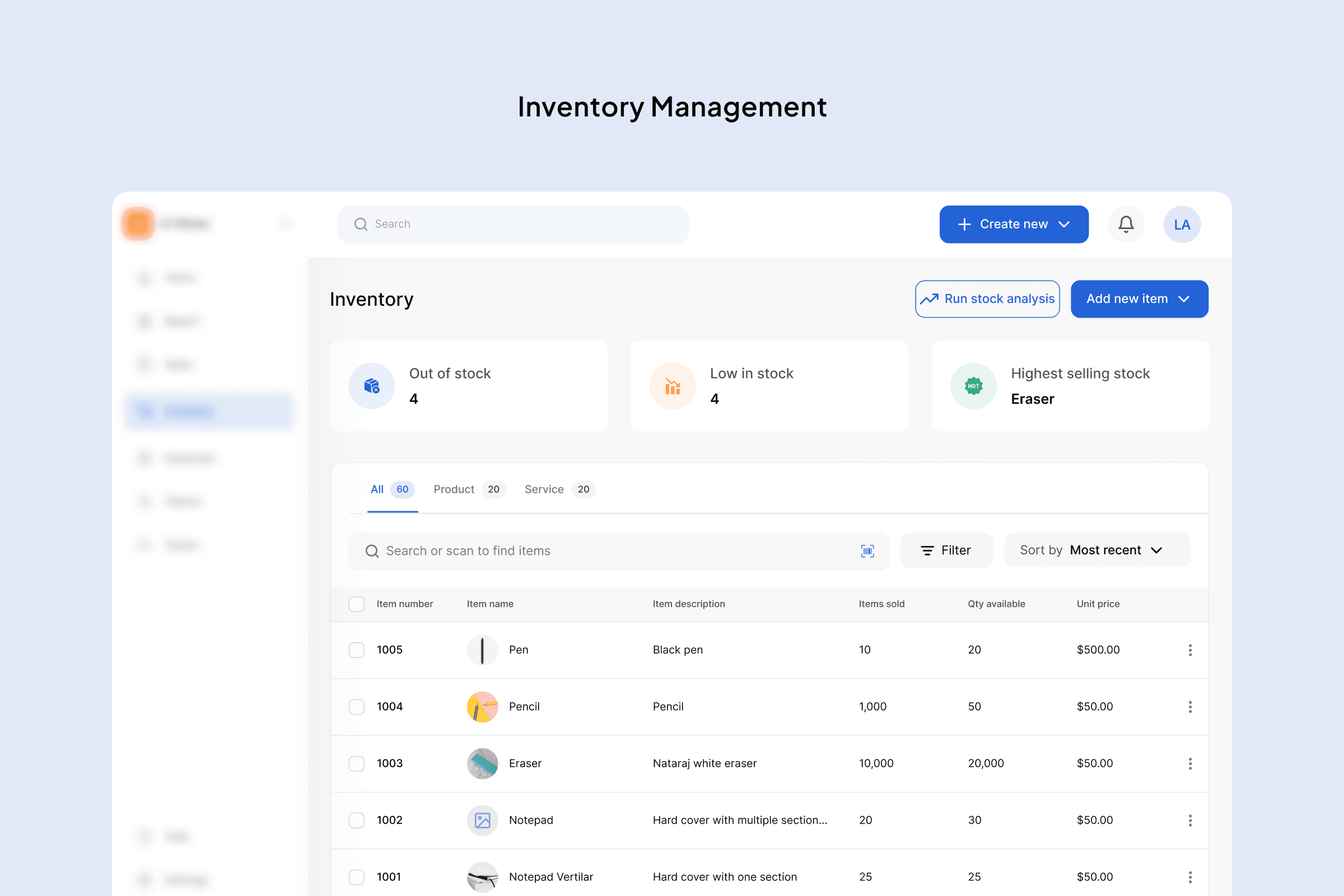
Vencru is an all-in-one invoicing and inventory management platform built for small and medium-sized businesses.
It helps business owners manage sales, track inventory, and understand their financial position without needing advanced accounting knowledge.
However, as the product evolved, the experience became harder to use.
The Problem
High Onboarding Drop-Off
Users dropped off early in the onboarding flow. After signing up, they were immediately asked to provide detailed business information.
This created friction and led to nearly 50% drop-off before onboarding completion.
Outdated and Rigid Interface
The interface felt outdated and difficult to navigate. Moving between modules like invoicing, inventory, and accounting was not seamless.
Disconnected Workflows
As new features were added, the product became more fragmented. Core workflows were not well connected, making simple tasks feel complex.
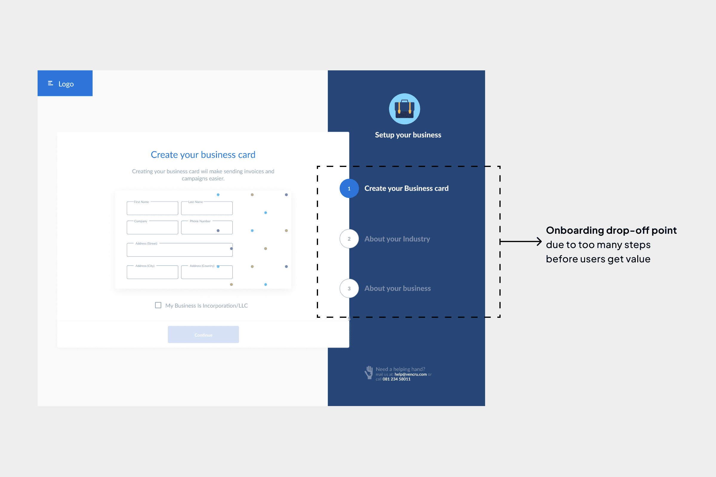
Old onboarding highlighting drop-off point due to added steps during onboarding
My Role
I led the redesign of the entire product experience, working closely with the Founder, Product Manager, Engineers, and another designer.
My focus was to improve usability, restructure the product, and ensure the system could scale as new features were introduced.
Research & Insights
To understand user behavior, I conducted user interviews and analyzed session recordings using FullStory.
Key Insights
01
Users were dropping off during onboarding because they were asked to provide too much business information upfront before experiencing any real value in the product.
02
Users struggled to move seamlessly between invoicing, inventory, and accounting due to disconnected workflows and unclear navigation structure.
03
The lack of key business features such as vendor management, purchase orders, and financial reporting limited how much users could rely on the product for their daily operations.
04
Many users did not perceive enough value after signing up, which contributed to churn, especially when compared to the effort required to fully set up and use the product.
Note: The product also suffered from multiple usability issues, including inconsistent content, poor UI patterns, visual inconsistencies, missing empty and active states, and limited data representation, all of which contributed to a weaker overall user experience.
Approach
Rather than focusing only on visuals, the goal was to rethink how the product works.
I focused on:
Reducing friction in onboarding
Simplifying workflows across modules
Creating a scalable design system
Aligning the experience with non-technical users
Designs
This was a full redesign focused on structure, scalability, and usability.
Onboarding Redesign
The onboarding experience required users to complete multiple steps immediately after signup, including detailed business information.
This created friction at the worst possible moment, leading to nearly 50% drop-off after account creation.
Solution
Rather than removing onboarding entirely, I focused on reducing the initial effort required while still capturing essential data.
Using insights from user interviews and behavioral data, I identified which fields were critical and which could be deferred.
The goal was simple: Let users get into the product faster, then guide them progressively.
I reduced onboarding to a single, simplified step, keeping only essential inputs. All other information, such as business details and branding, was deferred
Old onboarding flow with multiple steps to complete onboarding vs. New onboarding flow with a single step to reduce drop-off
Progressive Onboarding via Dashboard
Instead of forcing users to complete everything upfront, I introduced a dashboard-based onboarding checklist.
This guided users through key actions:
Complete business profile (logo, details)
Add a product or service
Create their first invoice
This approach allowed users to:
Move at their own pace
Access the product immediately
Still be guided toward meaningful actions
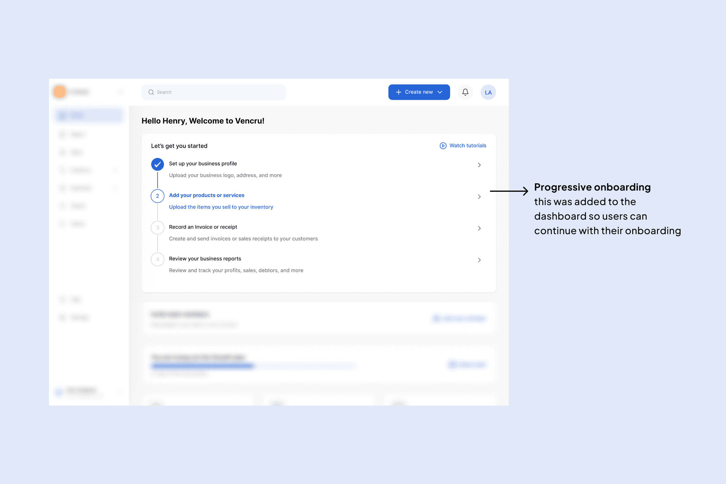
This shows the progressive onboarding steps added on the homepage also acting as an onboarding guide
Design System
There was no design system in place. Interfaces were inconsistent, and scaling the product was difficult.
Solution
I introduced a design system that established:
Consistent components and patterns
Typography and color usage
Reusable UI elements (buttons, forms, tables)
Structured layouts using auto layout and components
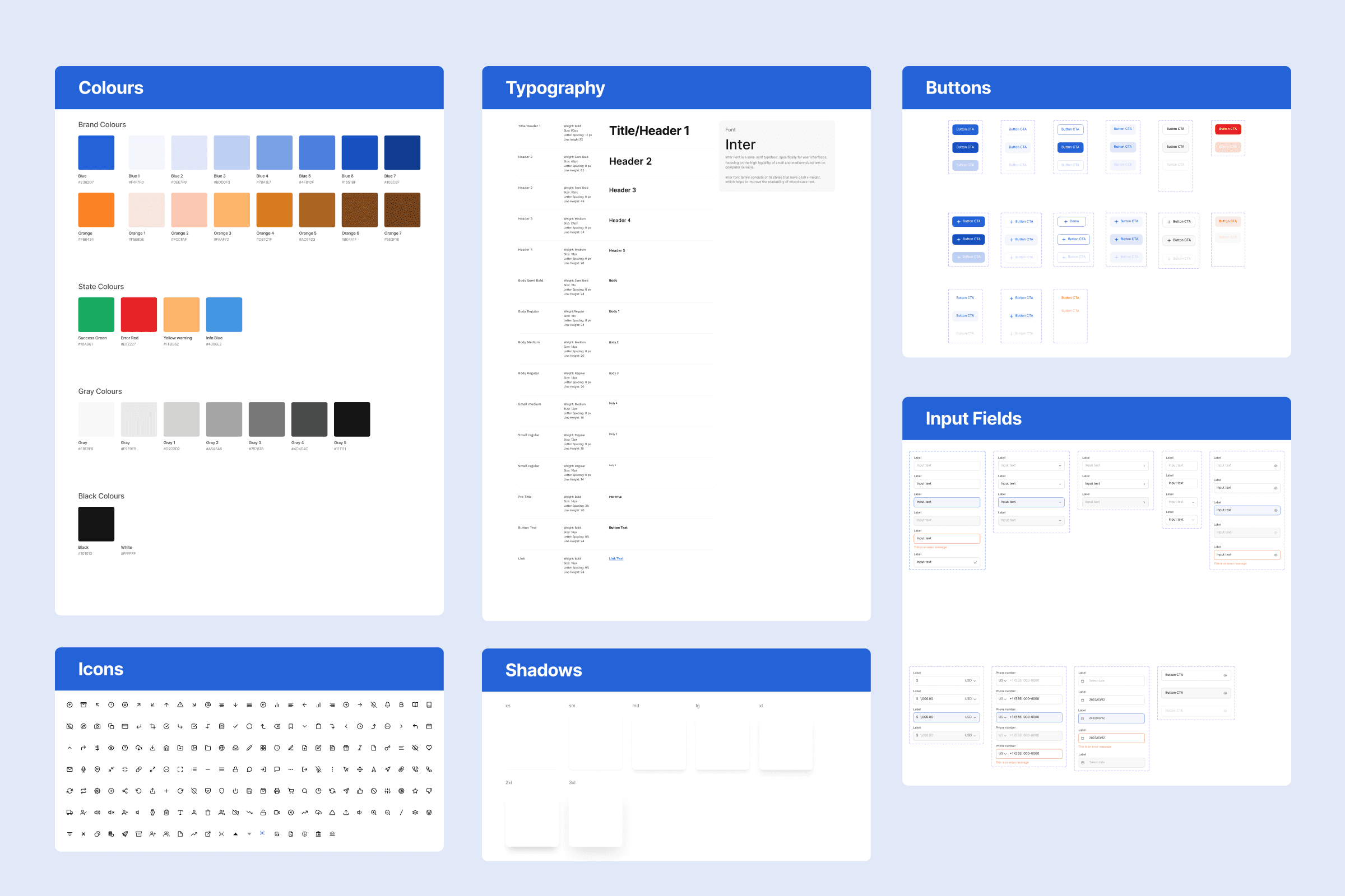
Vencru's new design system and components
Impact
Improved design consistency across the product
Faster design iteration and collaboration
Better alignment between design and engineering
Core Workflow Redesign (Invoicing Example)
Creating an invoice page had a lot going on on it, the cognitive load for users, especially first time users we are trying to keep, was too much.
Users had to repeatedly configure:
Invoice templates
Payment settings
Other setup-related inputs
This created friction and slowed down a core task.
Solution
I separated setup from execution.
Moved configurations (templates, payments, tax settings) into a dedicated Settings module
Simplified the invoice creation flow to focus only on:
Adding items
Adjusting quantities
Finalizing the invoice
By removing repeated setup tasks, users could focus on completing their primary goal without distraction.
Old invoice page with overloaded cognitive load and New invoice page with simple layout without overloading users
Settings Module where users can now update their invoice settings without overwhelming the invoice page
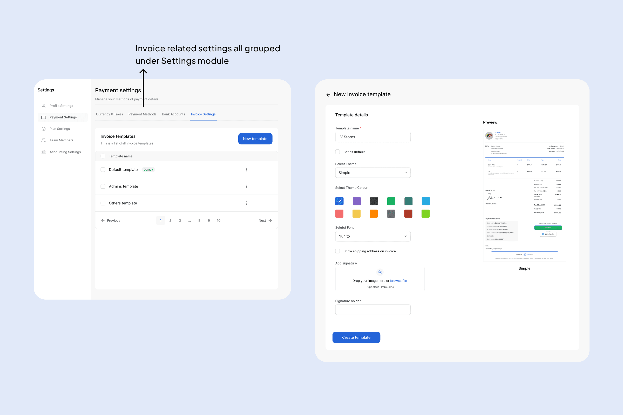
Invoice related settings moved to the Settings module
Old sales list and the new sales list looking more simplified
Feature Expansion & Value Delivery
Users did not feel they were getting enough value from the product, contributing to churn.
Key features expected by small business owners were missing.
Solution
I introduced features based on:
User requests
Competitive analysis
Core business needs
These included:
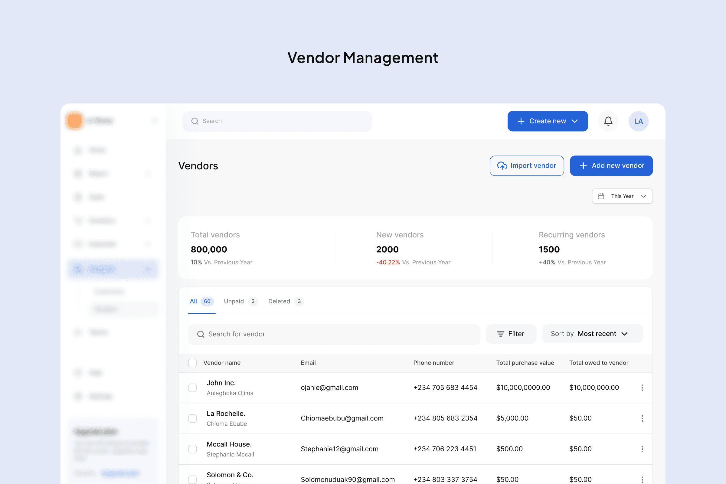
Vendor Management
Purchase Orders
Bill Management
Quotes
Multi-currency support
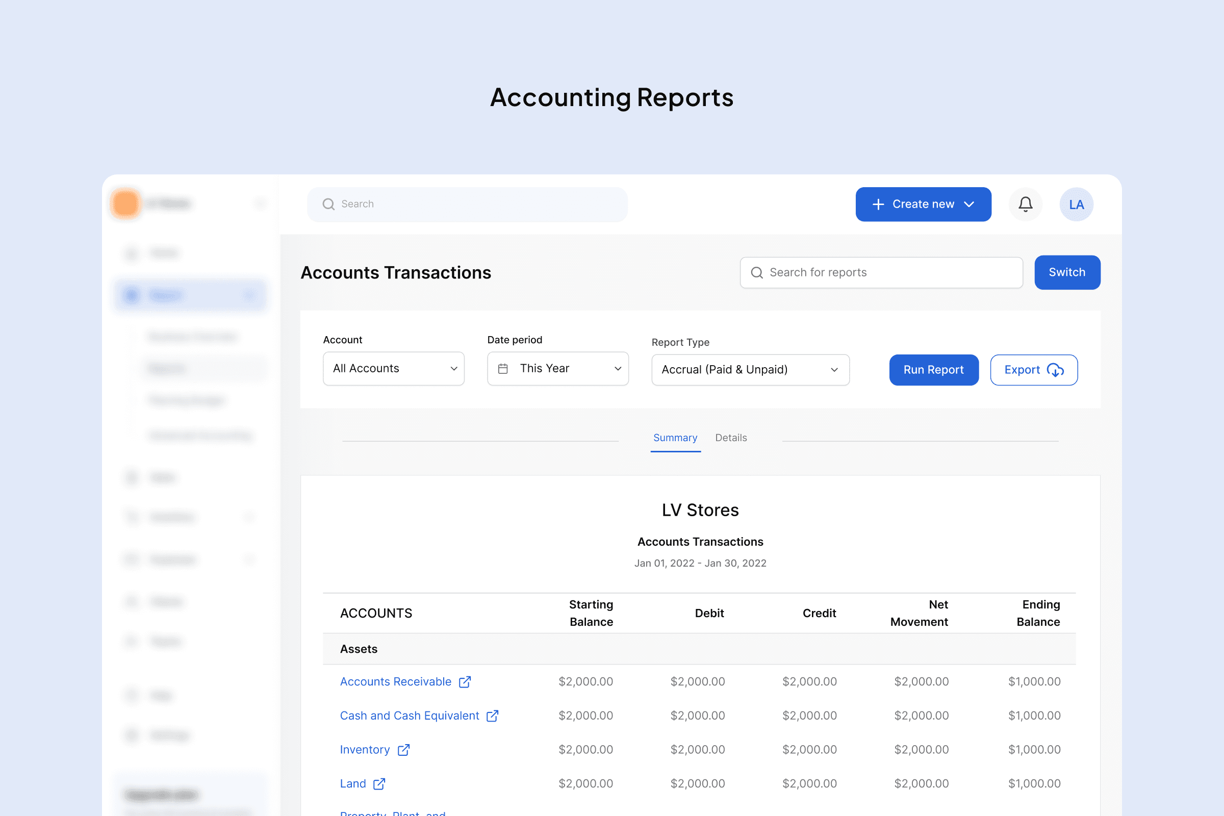
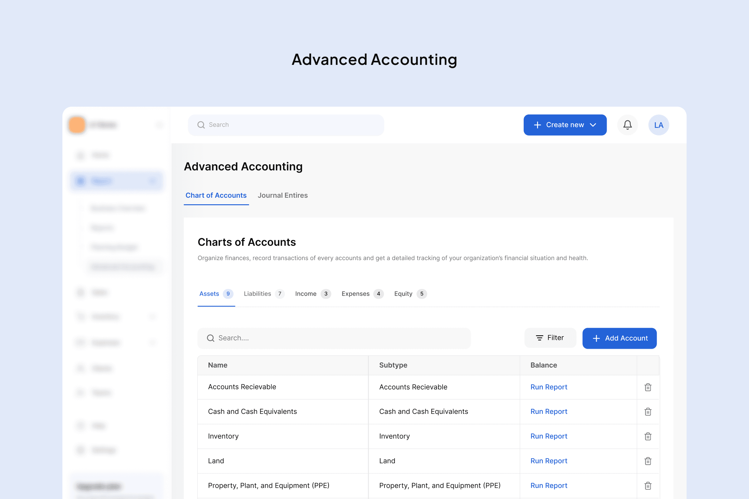
Financial reports
Trade-offs & Decisions
To maintain simplicity:
Some features were postponed (e.g. additional integrations, advanced accounting features)
Complexity was intentionally reduced to match the needs of SMB users
The goal was not to build everything, but to build what matters most.
Challenges
Balancing redesign with expansion was the biggest challenge.
New features had to integrate seamlessly with existing workflows while reducing friction across the product.
This required thinking beyond individual screens and focusing on the system as a whole.
Result & Impact
Improved overall usability across the product
Increased perceived value through feature completeness
Contributed to 15% reduction in churn over 6 months
35%
Increase in onboarding completion
15%
Reduction in churn over 6 months
Activation
Increased activation and first key actions
Drop-offs
Reduced onboarding drop-off based on funnel analysis
Reflection
This project reinforced the importance of designing systems, not just interfaces.
Reducing early friction and allowing users to experience value quickly had a direct impact on product performance.
It also highlighted the importance of balancing product growth with usability, especially in complex SaaS environments.